ClearIcons
The art and science behind a cohesive Visual language
Custom
travel
icons for
Cleartrip
The backbone of Icon design
In the icon design field, understanding the rules is like mastering a language: one must learn the grammar before they can express yourself with ease. Grasping the foundations of icon design, such as the harmonious blend of grids, key lines and basic shapes, helps create visually consistent and intuitive interfaces.
Grids are structured frameworks used in design which consist of intersecting horizontal, vertical and sometimes diagonal lines that guide the placement of elements to create organised compositions. Although grids primarily serve as guiding frameworks, sometimes they can be very restrictive.
Grids are structured frameworks used in design which consist of intersecting horizontal, vertical and sometimes diagonal lines that guide the placement of elements to create organised compositions. Although grids primarily serve as guiding frameworks, sometimes they can be very restrictive.
Munich 1972 : Standard of Icon Design
Munich 1972 :
Standard of Icon Design
Otl Aicher totally changed the game for modern symbols and icons with his iconic pictograms for the 1972 Munich Olympics. He came up with a grid system that kept his designs consistent while giving them a fresh and dynamic look.
In a world before digital design, Aicher's grid made it super easy to resize and scale his icons for signage, posters, and more—keeping them crisp and clear no matter where they were used. His work set the stage for the sleek and functional design styles we love today.
In a world before digital design, Aicher's grid made it super easy to resize and scale his icons for signage, posters, and more—keeping them crisp and clear no matter where they were used. His work set the stage for the sleek and functional design styles we love today.

Building the Grid
Building the Cleartrip Grid
The frame - This sets the boundaries for the icons.
The safe area - A buffer zone around the frame.
The primary grid - This lays down the basic alignments and proportions
The primary grid - This lays down the basic alignments and proportions
2
24
Our standard icon is placed on a 24 px grid and we use a 2px padding all around, providing a
20 px live area.
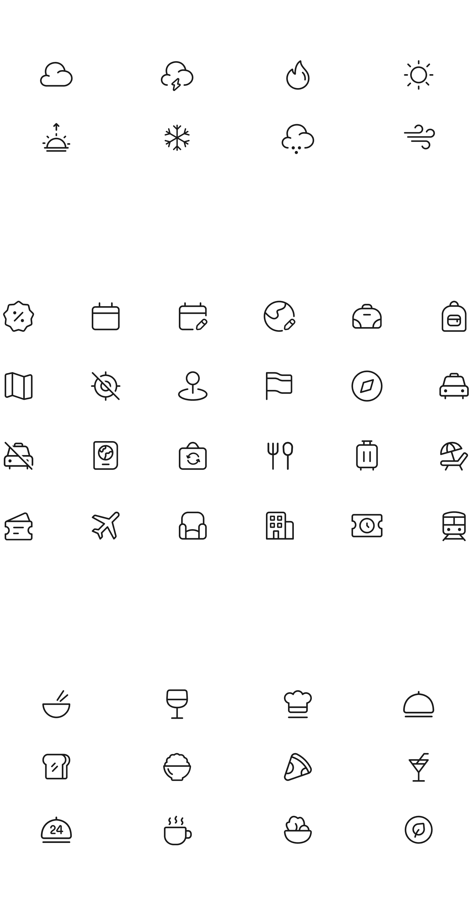
350 hand
drawn icons
Grouped into
categories
Shop
Weather
Currency
ClearIcons:
Custom
travel icons

Optimised for both
web and mobile
350 hand
drawn icons
Grouped into
categories
Shop
Weather
Currency

Custom
travel
icons for
Cleartrip

Optimised for both
web and mobile
350 hand
drawn icons
Grouped into
categories
Shop
Weather
Currency
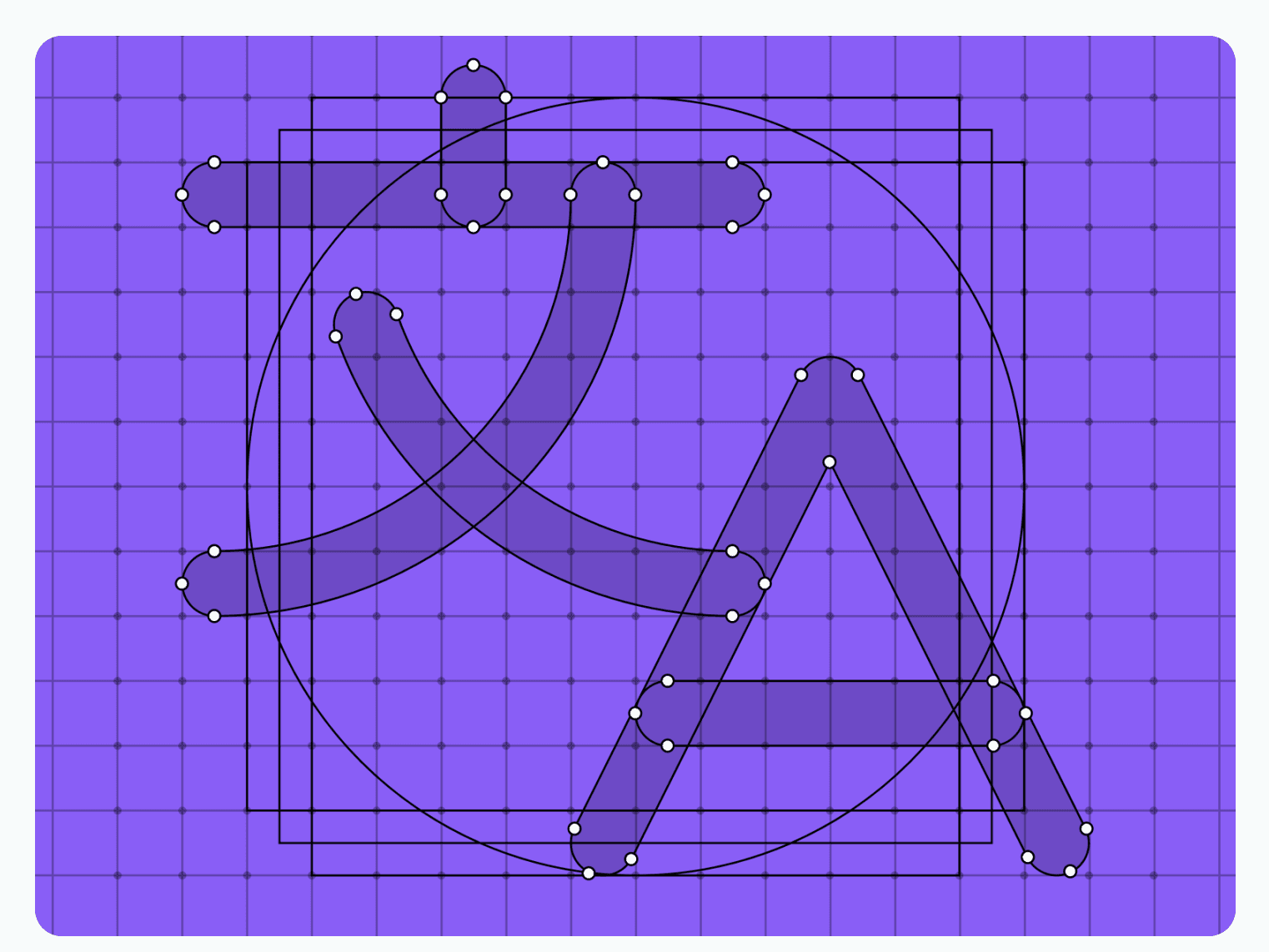
Characteristics of ClearIcons
One of our core principles is familiarity, so we don’t deviate too far from the original metaphors. However, we’ve infused a touch of fun and travel into all our icons, while maintaining a clean and minimal aesthetic. This blend ensures that our icons are not only recognisable but also bring a unique Cleartrip touch.
Cut outs - When showing the stack order of elements, we don’t emphasise the separation. Icons are 1 px away from the element behind them.
Round end caps - At ClearIcons we always use rounded end caps.
Rounded Edges - Large
Used for larger squares or rectangular shapes that may frame the icon.
Rounded Edges - Small
Used for extra small details & most acute angles.
Filled vs Filled - Icons that can’t close should have a thicker stroke by .5px. Note that the stroke may need to shift to hit the grid still.
Filled vs Filled - Icons that can close, should be filled, with inside shapes being subtracted.
The Key Shapes
Key shapes are pre-defined objects that have been tested and vetted for sizing so that each icon takes up a similar amount of volume on the page which helps ensure that our icons
retain a similar optical weight.
In other words, they all “feel” the same size, regardless of their actual dimensions.
Key shapes are pre-defined objects that have been tested and vetted for sizing so that each icon takes up a similar amount of volume on the page which helps ensure that our icons
retain a similar optical weight.
In other words, they all “feel” the same size, regardless of their actual dimensions.
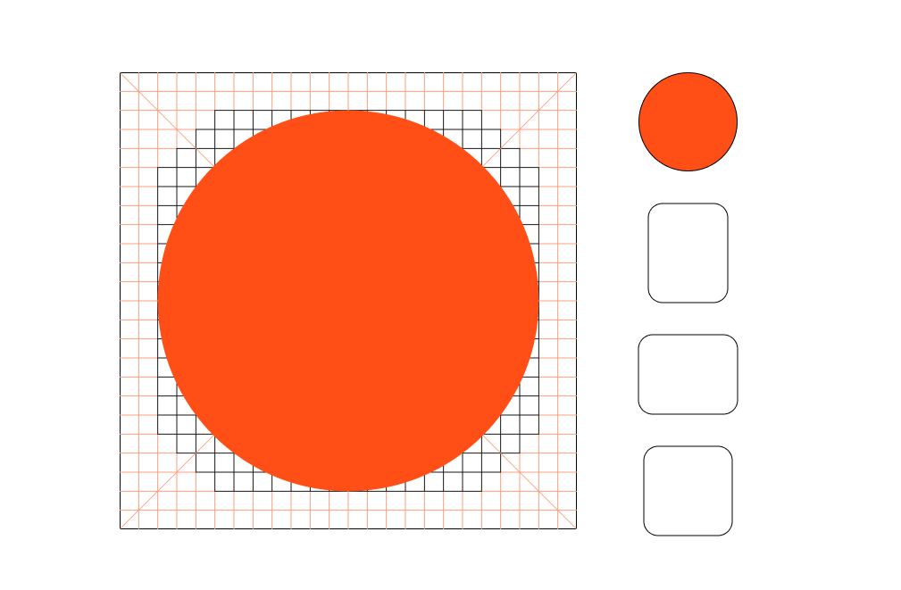
Introducing a slight size difference by making the circles a bit larger than the squares can significantly influence the visual balance.
In typography, circular letters such as the "O" protrude from the the height of the uppercase to provide a sense of equilibrium.
Introducing a slight size difference by making the circles a bit larger than the squares can significantly influence the visual balance.
If we keep the circle and the square at the exact same size, the square will always look larger. A small optical adjustment will make both shapes appear to be the same size
If we keep the circle and the square at the exact same size, the square will always look larger. A small optical adjustment will make both shapes appear to be of the same size
A similar rule is applied in typeface design
Rectangles on the other hand, would present more "extreme" proportions. So to keep them balanced we'll normally take the width of the circle to set the width of the horizontal rectangle while making it slightly shorter than the square.

Thank you for watching.
View another?
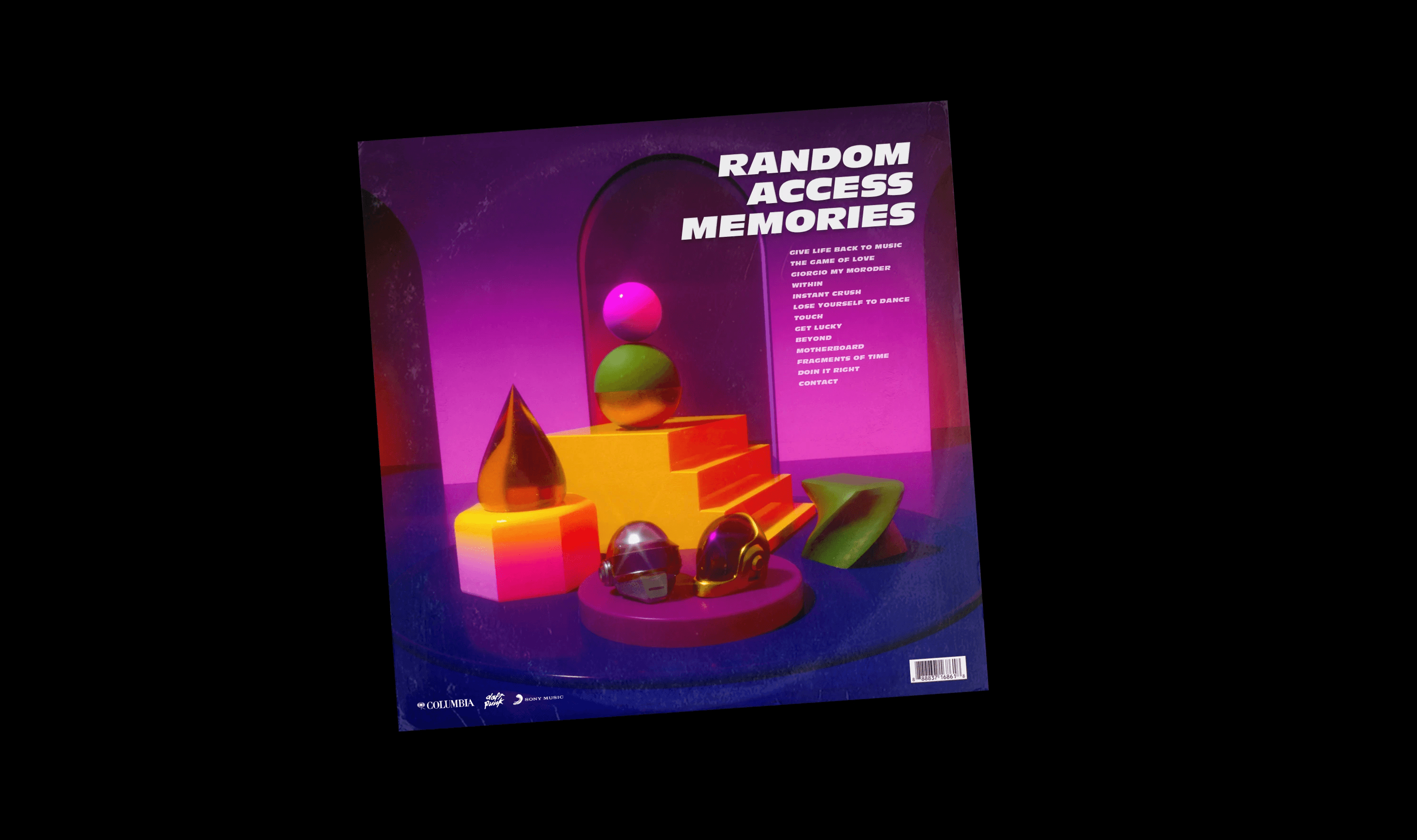
Tribute to Daft Punk
A visual take on Instant Crush by Daft Punk
RESUME
OTHER WORK
EPILOGUE
Have something
in mind? Let’s connect!
The website is typeset in Telegraf by Pangram-Pangram and General Sans by Indian Type Foundry. Developed in Framer. (No-code gang!)
RESUME
OTHER WORK
EPILOGUE
Have something
in mind? Let’s connect!
The website is typeset in Telegraf by Pangram-Pangram and General Sans by Indian Type Foundry. Developed in Framer. (No-code gang!)
RESUME
OTHER WORK
EPILOGUE
Have something
in mind?
Let’s connect!
The website is typeset in Telegraf by Pangram-Pangram and General Sans by Indian Type Foundry. Developed in Framer. (No-code gang!)